Flow
The flow section shows what's happening to work in flight under three different lenses. The charts in this section are not targets or dashboards. They are not designed for measuring individuals. The team reads the shape of the data, which matters more than the number. The Teamwork view shows who is working together.
Cumulative flow
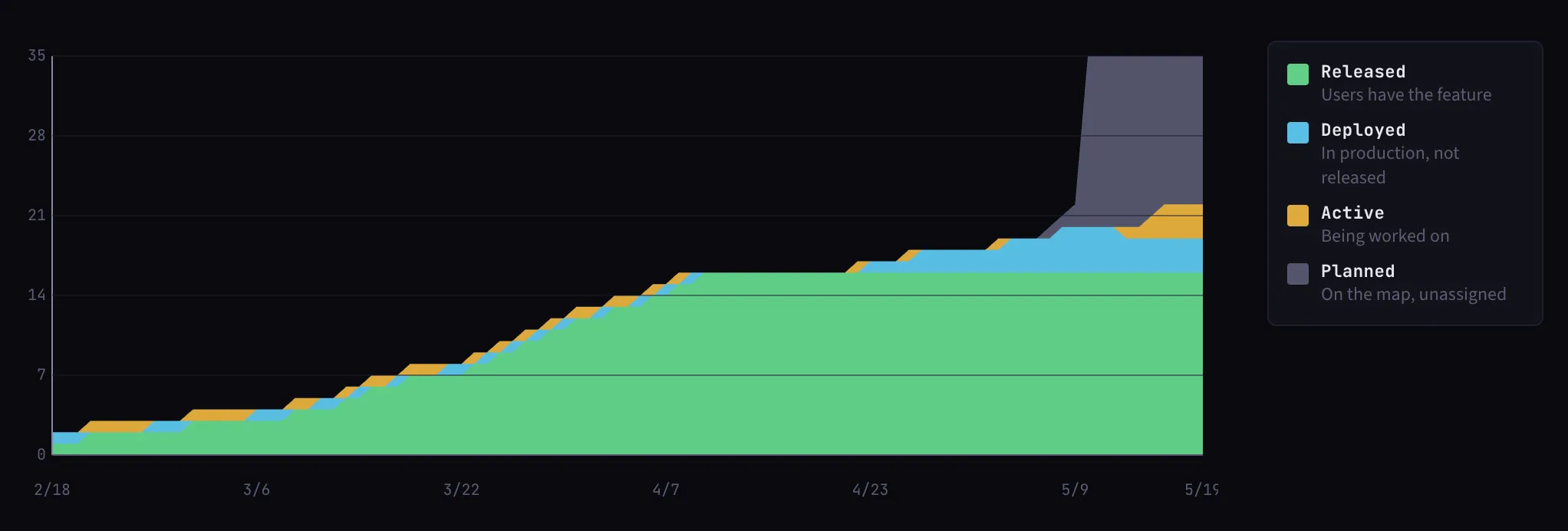
Four bands stacked over time:
- Planned
- Active
- Deployed
- Released
Indicators:
- Widening bands mean work is accumulating at that stage. Something is blocking flow.
- Parallel bands mean steady flow. Work enters and leaves each stage at roughly the same rate.
- The gap between deployed and released is unreleased inventory. If this gap widens, the team is deploying but not releasing. The Inventory view shows the detail.
Throughput
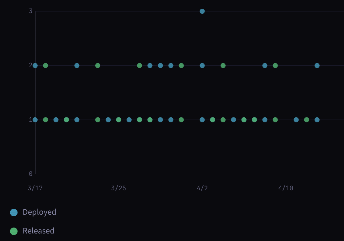
How many stories released per period. Each dot is either a deploy, a release event, or both overlaid.
- Look for patterns over time rather than individual data points.
- No velocity charts or story points. One story is one story.
On estimation
Story points measure effort up front, before the work starts, based on guesses. Lead time measures what actually happened, after the work is done, based on real data. One is wishful thinking, the other is a measurement based in reality.
Mainline uses measurement. The team's lead time distribution builds automatically as stories are released. When an active story becomes an outlier against that distribution, it gets flagged. The team's own history tells you when a story is too big.
Points create waste in the form of re-work, arguments, lost time that could have been used learning from building the actual thing. "Can we split this into two releasable pieces?" is always a better conversation than "how many points is this?", or "You promised us 10 points, and we only got 7".
Lead time
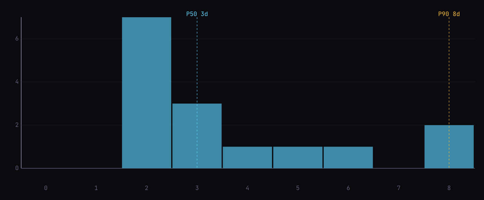
Lead time from start to release is tracked for every story. Over time this builds a distribution based on the team's actual delivery rhythm, based on real history.
- Percentile based. A separate calculation checks whether any active story is an outlier against that distribution. If it is, the story gets flagged on the map.
- Self-calibrating. The split threshold comes from the team's own history (80th percentile by default, configurable in Settings). As the team changes, so does the bar.
Filtering
All three charts accept a time range (30, 60, or 90 days) and an optional map filter. The defaults show the last 30 days across all maps. Filter to a single map to see that product area's flow in isolation.